Beantown Bouquets
The Challenge
Online flower shops have little ability for customization and inefficient systems for browsing through products. The goal of this project is to create a responsive website that meets the user's need for an easy way to order custom flower arrangements and bouquets online.
The Product
Beantown Bouquets is a responsive website for ordering custom flower arrangements online. The typical user is between 25 - 40 years old, and most users are career professionals.
My Role
UI/UX Design | User Research | Journey Mapping | Wireframing | Information Architecture | Interaction Design | Design Systems | Design QA
Completed
2021
Defining the Process
I broke the project down into four key phases, each comprised of important steps. This approach helped plan out the project roadmap and determine key milestones and deliverable dates. With the tight timeline to MVP, working with an agile, sprint-based process allowed me to iterate on and validate potential solutions early and often.

Empathize & Analysis
I conducted user interviews, which I then turned into empathy maps to better understand the target user and their needs. Through this, I discovered a common theme of users wanting to avoid having to call flower shops for their orders and wanting to do the entire process quickly online. At the same time, users reported being frustrated because some websites were overwhelming and confusing to navigate.
An audit of a few competing local flower shops provided direction on gaps that could be filled with Beantown Bouquet's website. From the data gathered, I determined that overall our competitor's strengths are user flow, navigation, and visual design. All three competitors showcased their products online, however, only two had online ordering. None of the competitors had custom orders online, the closest to this is Louis Barry which had contact information for custom orders.

Online Avaiblitity
Many local flower shops lack an online presence and those who do have limited online ordering options.

Navigation
Local flower shop's online storefronts are often busy and in need of modern updates, which results in confusing navigation.

Experience
Local flower shop's websites do not provide an engaging browsing experience for its users.
Pain Points:
Creation
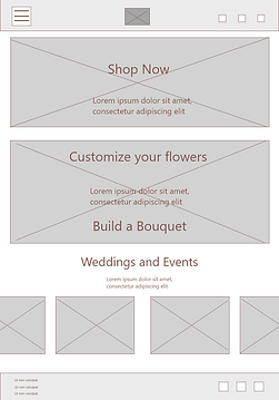
I sketched out paper wireframes for each screen in my design, keeping in mind the user's pain points about navigation, browsing, and flow.
The low-fidelity prototype (made in Adobe XD) included a primary user flow for ordering a bouquet of flowers online.

Desktop
Tablet


Mobile

Designs for different screen sizes were created to make sure the site would be fully responsive on various platforms.
Usability Study
A usability study was conducted using the following parameters:
-
Study type: Unmoderated usability study
-
Location: Remote
-
Participants: 10
-
Length: 30-60 minutes
These were the main findings uncovered by the usability study:

User Flow
Participants struggled with ordering flowers. They claimed to get stuck on the "add to cart" screen and were not able to return to the homepage after checkout.

Scrolling
Participants were frustrated with the amount of scrolling necessary to locate the part of the site they wanted.

Editing Shopping Cart
Most participants reported wanting a way to edit the items and change the delivery date when looking at the shopping cart page before checkout.
Before usability study

After usability study

The add-to-cart page was redesigned into be an overlay to help with navigation and user flow.
Before usability study

After usability study

The entire color scheme was changed to better align with color and contrast accessibility standards. The home page was redesigned to be more welcoming to users.
Accessibility Considerations:
Headings with different sized text was used for clear visual hierarchy
Landmarks were used to help users navigate the site, including users who rely on assistive devices
Alt text was added on each page for smooth screen reader access.
Production

The designs for screen size variation included mobile and desktop. I optimized the designs to fit the specific user needs of each device and screen size.
I established a flexible design system that includes visual styles, components, and a comprehensive set of guidelines and best practices for usage. The design system not only improved efficiency during the design process but also ensured the platform could continue to evolve and maintain visual consistency.

Final Outcome
Beantown Bouquets has reached its goal of creating an easy way to order custom flower arrangements and bouquets online. The target users have shared that the design is engaging and is easy to navigate through.
Takeaways
I learned that even the smallest design changes can have a large impact on the user's experience. Focusing on the user's needs and feedback on this project was a great help with establishing how to best design the website. Also, figuring out how to redesign the responsive website for a mobile screen was a fun challenge.
Kailey Martin


